COCA Provider Directory
- Role
- Product Designer
- Timeline
- 2021 · 4 months
- Platform
- Responsive Web
- The problem
- The nonprofit's list of therapists was a Word document. You couldn't search it or filter it, and it didn't help you tell who was a good fit. People used it to pick a therapist at a hard time, and many of them were older adults.
- What I did
- I ran research sessions with people who had just looked for a therapist. Then I designed a new directory that works on any screen. I did its structure, how it works, its words and its access for people with disabilities. Its filters match how people really choose.
- What changed
- It met WCAG 2.1 AA and replaced the document. In testing, 89% of people finished their task. Finding a good match took 68% less time. Site traffic grew more than 400% after launch.
Overview
The Central Ohio Counseling Association's provider "directory" was a Microsoft Word document: a static list with no search, no filtering, and no way to judge fit, on a site that had never had an interactive feature. Finding a therapist is a high-stakes, emotionally loaded decision, and the absence of a usable tool was a direct barrier to people getting care.
Many of the people using it were older adults, and many were not comfortable with technology. That set the bar: nothing could depend on knowing the right search term, and no wrong turn could leave someone stranded.
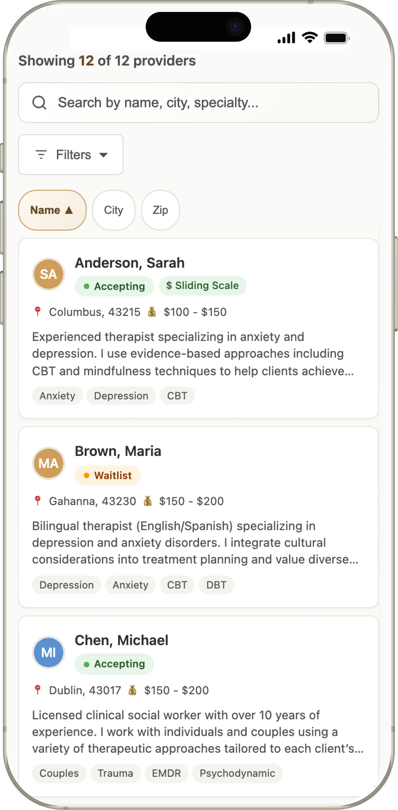
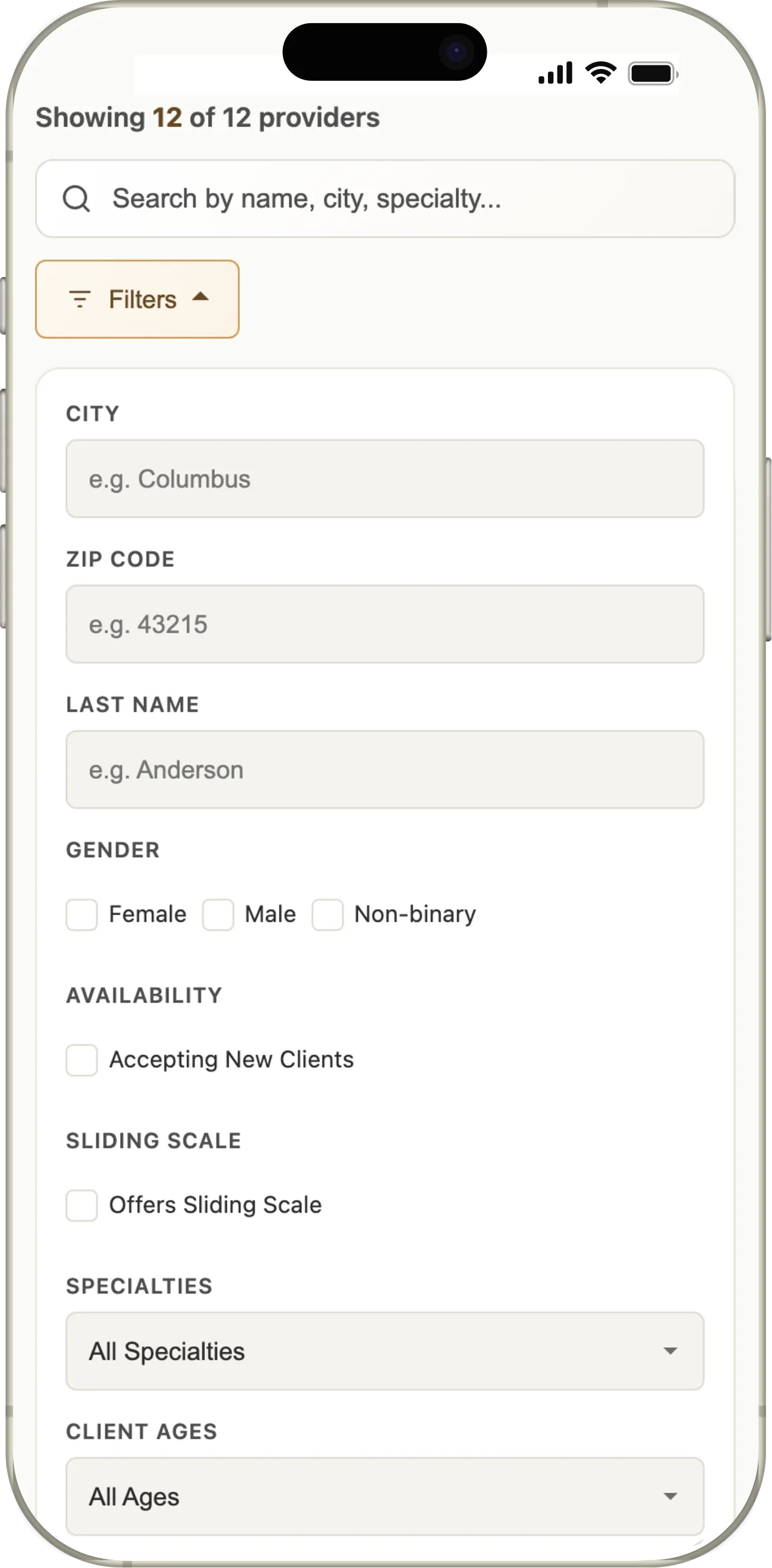
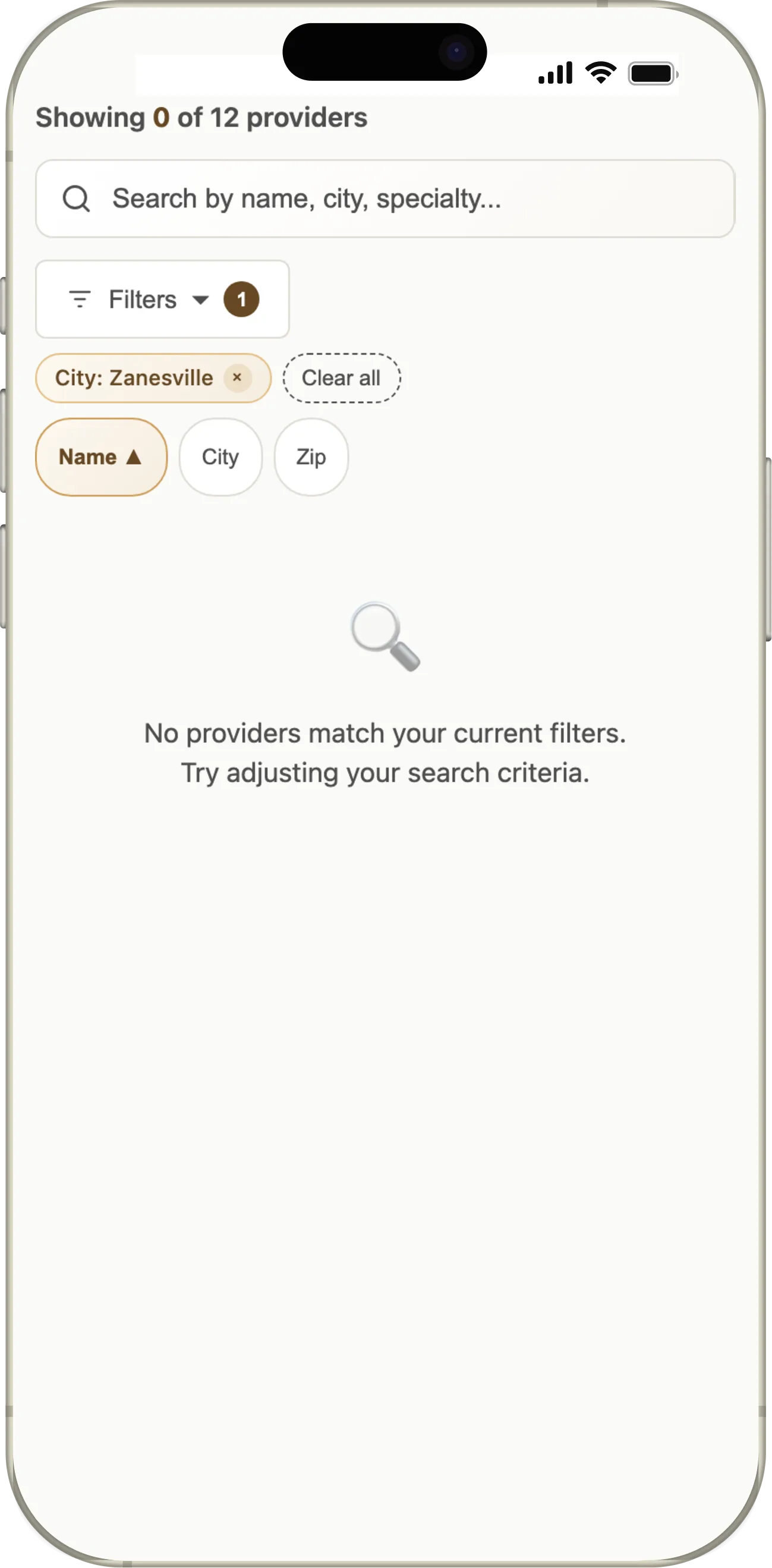
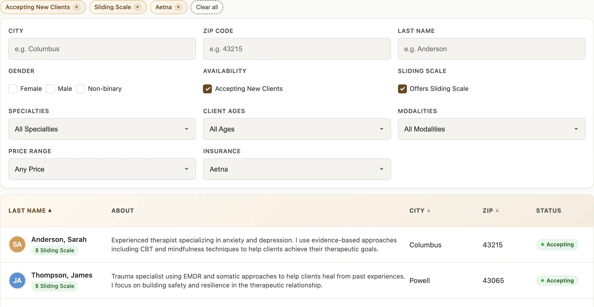
Reconstruction of the directory as it shipped. Provider data is illustrative.
Problem
The directory was a Word document
Most people seeking therapy don't know what to search for. They know how they feel, what kind of support they need, and what practical constraints they have: insurance, location, session format, availability. The list gave them names and phone numbers.
- No way to filter by insurance accepted, telehealth, or sliding-scale fees
- No provider profiles, so no context for deciding who might fit
- Fields weren't filled out consistently from one provider to the next
- No search, no sort, no structure of any kind
- No interactive features anywhere on the site to build on
- COCA staff fielded the calls this created, one at a time. Everyone else gave up.
Research
Listening to people in a vulnerable moment
I ran moderated sessions with eight people who had recently searched for a therapist, some who found one and some who didn't: task-based testing of the old Word doc directory, then a search with an early prototype of the new one. I also interviewed six COCA staff who took the calls from people the site had failed, and audited the directory against WCAG 2.1 AA.
- 1 Do they take my insurance? Not available
- 2 Do they offer telehealth? Not available
- 3 What does their approach feel like? Not available
- 4 What are their formal credentials? Listed, and ranked last by users
Every participant named insurance or session format first.
- People needed to know how a provider works before reaching out. Looking at the old directory, participants wanted to know a provider's approach before they'd call. The list gave them a name and a phone number.
- The early prototype's search felt clinical and cold. That feedback set the direction for the visual design.
Decisions
Filters that match how people choose a therapist
A search box assumes you know the words. The directory was built around structured filters for what research showed people weigh first: insurance, whether a provider is taking new clients, cost and sliding-scale fees, and specialty. Free-text search stayed for anyone who already knows a name. Active filters show as chips you can remove one at a time, so narrowing never means starting over.
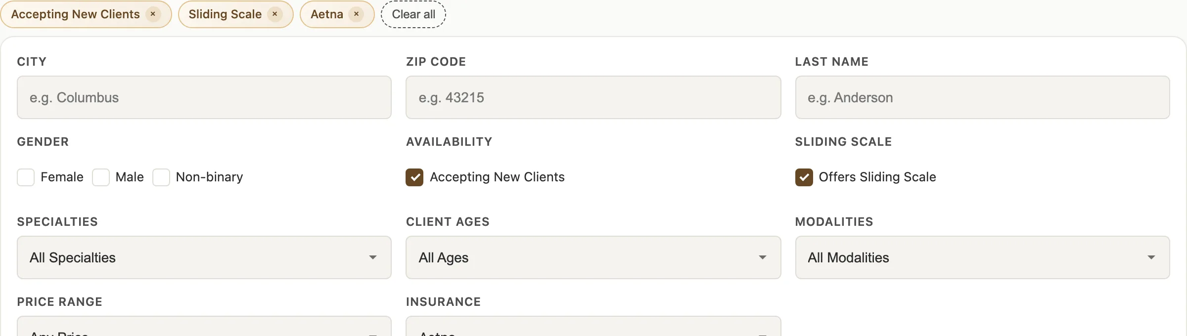
Profiles ordered by the questions people asked
Each provider's profile page was reordered around the questions from research. The first three fields answer "is this person right for me?" before anyone scrolls. Credentials are still there, at the bottom, where users had ranked them. No screens of the profile page survive, so the order is shown here as a diagram, and the mobile profile is reconstructed under Craft.
Original field order
- Name
- Credentials
- Licensure
- Specialties
- Phone number
Nothing here answers "is this person right for me?"
Redesigned field order
- Name and phone number
- Insurance accepted
- Session format and availability
- "About my approach," in their words
- Specialty areas
- Credentials and licensure
The first three answer it before anyone scrolls.
The "about my approach" section is rich text, so providers could write it their own way and add links, images, and formatting. That was deliberate: research showed clinicians disliked other directories that scripted their profiles too much.
Build new, don't retrofit
Rather than bolting features onto a static WordPress site, I designed the directory as a standalone, embeddable module with no dependency on the legacy codebase. It also had to work as a table on a desk and as cards on a phone, since most people searched from one.
Craft
A profile card that answers the question
Testing showed the early prototype's search felt clinical and cold, so the visual system went warm: a gold accent, soft surfaces, generous type. Every element on the card is there because a participant asked for it.
- A Availability first. "Are they taking new clients?" was the question people asked staff most. Waitlisted providers stay in the results, marked as waitlisted.
- B Practical constraints in one line. Insurance, session format, location, and cost: the things that rule a provider in or out before anything else.
- C Their own words, above the fold. People said they wanted to know a provider's approach before they'd call.
- D Specialties as plain tags. Scannable, and they match the filter vocabulary exactly, so what you filtered on is what you see.
- E Credentials last. Still present for the people who want them. Users ranked them fourth of four.
Warm, and accessible by construction
Every component was built to WCAG 2.1 AA: contrast checked on the gold and the status colors, visible focus on everything interactive, a mobile-first layout, and filters that work with a keyboard and a screen reader. Large type and plain labels were for the many older and less technical users the directory served, not only for the audit.
Interactive Demo
An interactive walkthrough of part of the directory as it shipped. Try the filters, search, and explore the provider results to see how the filters narrow the list.
Designs shown reflect the product at the time of my involvement, with text colors deepened to 7:1 for this portfolio. Open the demo in a new tab ↗
Outcomes
Usability testing of the redesign improved every primary metric, with the biggest gains in task completion and confidence. The directory shipped to WCAG 2.1 AA and replaced the Word document entirely. After launch, the site it lived on saw its traffic grow by more than 400%. A directory people could actually use turned a page nobody visited into the reason they came. It stayed in use for about five years, until COCA rebuilt its site so non-technical staff could maintain it.
For someone looking for a therapist, a directory they can’t use is often where the search ends. How the information is organized decides whether they find help.