Design Systems
Systems that scale
with the product.
Every design system I've built started inside a real product, not a Figma sandbox. They exist because a team needed to ship faster, stay consistent across platforms, and hand off without friction. Tokens, components, and documentation are only useful if they solve real problems at scale.
Featured Case Study
One system, end to end
Fittra Wellness · 2026
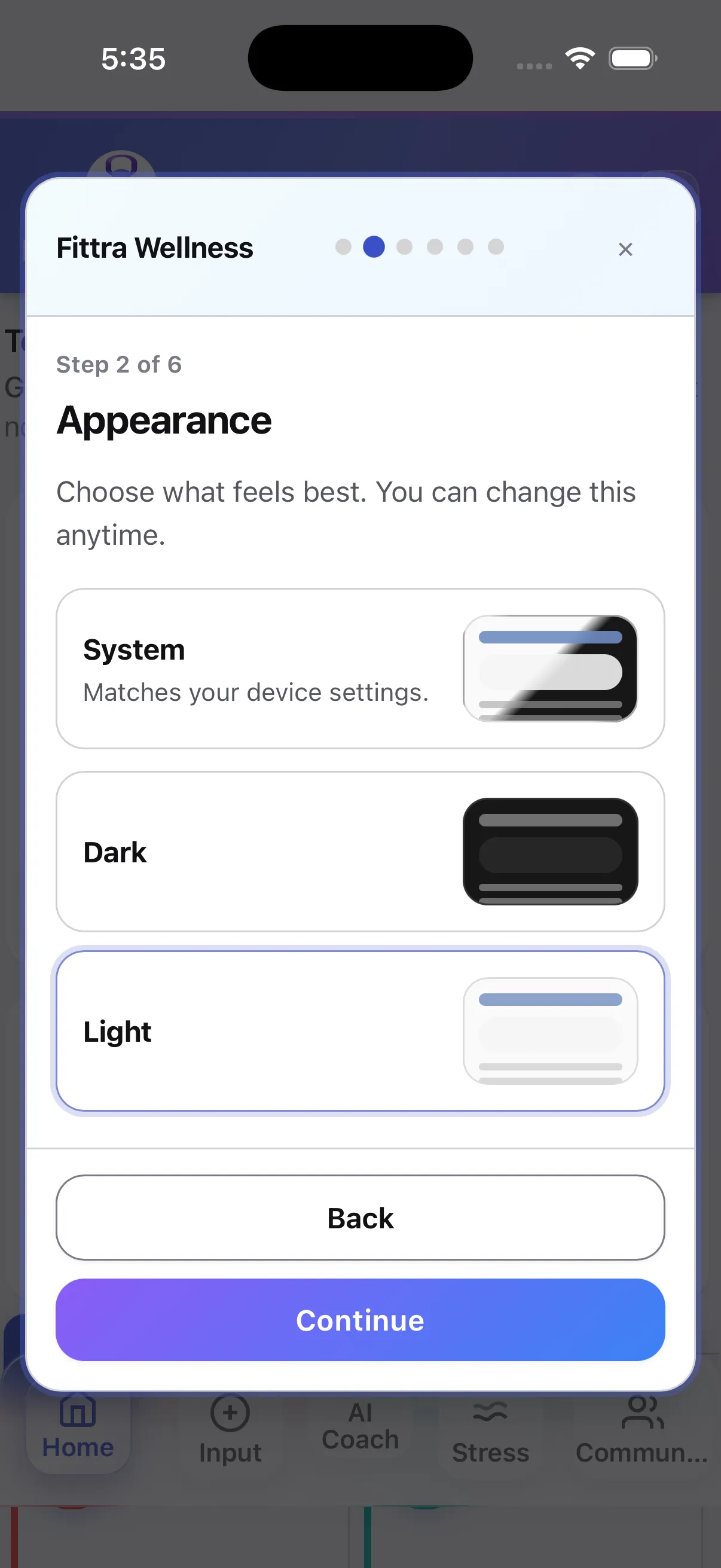
Fittra: a shipped design system on iOS & Android
Zero-to-one component library for a live wellness app, built alongside the product in Figma and carried through to shipped code. Designed and built solo with AI-assisted tooling, shipped to iOS and Android via Capacitor, on a tokenized foundation covering color, typography, spacing, dark mode, and WCAG 2.1 AA accessibility patterns.
Brief
Fittra needed a design system that could support a full wellness product shipping to iOS and Android on day one, without the team ever stopping to refactor color or spacing later. Visual consistency and dark-mode support were table stakes; handoff speed and accessibility were the real goals.
Approach
Built a three-tier token architecture; primitives, semantic, component that were
consolidated into a single source of truth fittra-design-system.css.
Components were designed in Figma and implemented in Angular alongside the product,
so every component earned its place by solving a real screen need first.
What shipped
24 reusable components powering 25 screens across iOS and Android, backed by 791 design tokens and a dedicated WCAG 2.1 AA accessibility layer (focus-visible, skip link, focus trap, reduced-motion). Dark mode is a fully mapped token set, not retrofitted styling.
The token count reflects a tiered structure rather than a flat list: primitive tokens define the raw values, semantic tokens map them to intent, and component tokens bind intent to specific components. That layering is what makes dark mode and cross-platform theming a change in one place instead of twenty-four.
Accessibility
WCAG 2.1 AA, built in not bolted on
Fittra ships with a dedicated wcag-focus.css layer: enhanced focus
indicators, skip link, focus trap, sr-only utility, and
prefers-reduced-motion support. 17 components carry
explicit ARIA attributes and 10 use semantic role=
values. Accessibility is a structural concern, not a retrofit.
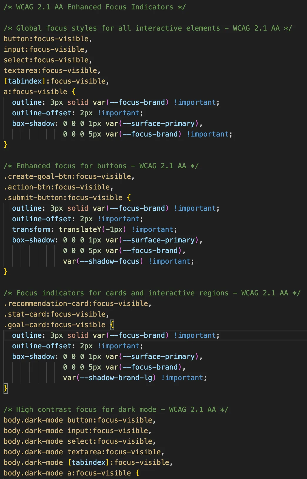
wcag-focus.css · enhanced focus indicators & a11y utilitiesPrior Systems
Additional systems and shipped work
-
Central Ohio Counseling Association · 2021
COCA Component Library
Role · Lead designer
Accessible, warm component library for a responsive healthcare web directory. WCAG 2.1 AA throughout, with an approachable non-clinical visual language.
Principles
What guides every system I build
Build with, not before
Design systems are most useful when built alongside real products, not as standalone upfront deliverables. Components earn their place by solving actual problems.
Tokens are the foundation
Color, typography, spacing, and motion are defined as named tokens, not hardcoded values. This makes theming, dark mode, and cross-platform consistency tractable.
Accessibility is structural
Accessible patterns are built into components from the start: focus states, contrast ratios, screen reader semantics. Never retrofitted after the fact.
Documentation enables scale
A component without clear usage guidance, do/don't examples, and handoff notes will be misused. Documentation is part of the component, not an afterthought.
Token Architecture
Real tokens from fittra-design-system.css
Tier 1 · Primitive
Raw values consolidated into a single source of truth. Never used directly in components.
-
--blue-500 = #3b82f6 -
--green-500 = #14b8a6 -
--amber-500 = #f59e0b -
--neutral-900 = #171717
Tier 2 · Semantic
Named by purpose, not value. Components consume these. This is what makes Fittra's dark mode a mapped token set rather than overrides.
-
--text-primary → neutral-900 -
--bg-subtle → neutral-50 -
--brand-primary → blue-500 -
--success → green-500
Tier 3 · Component
Scoped to specific components. Built from semantic tokens so component-level theming stays surgical.
-
--bg-brand → brand-primary -
--surface-primary → bg-subtle -
--focus-ring → brand-primary -
--bg-warning → amber-500
Governance
Consistency without bottlenecks
Governance exists to protect consistency, not to block teams. A system that slows delivery gets routed around, which is worse than no system at all. The goal is to make the right path the easiest one, and leave clear escape hatches for the cases where it isn't.
Tiered ownership, not a single gatekeeper
Core components live with the systems team; shared patterns live with the teams that use them most. A new primitive ships under a different review bar than a one-off feature tweak.
Escape hatches are part of the system
Every token, component, and pattern has a documented override. Teams can ship local variations when a deadline demands it, as long as the divergence is visible and tracked.
Track debt, don't prevent it
Shipping a component that isn't fully tokenized is fine if it's tagged as such. What matters is that the debt is catalogued, prioritized, and actually revisited, not that it never exists.
Reviews scale with blast radius
Changing a button color affects one component. Changing a padding scale affects every screen. Governance weight should match the consequences of the change, not apply uniformly.
Hiring for a design systems lead?
I build systems that ship, scale across platforms, and survive real governance pressure. If you're standing up a new system, maturing an existing one, or recovering from a stalled rollout, let's talk.
Get in Touch