Fittra Wellness
- Role
- Lead UX/Product Designer
- Timeline
- 2025 - 2026 · 8 months
- Platform
- iOS · Android
- Ownership
- UX, UI, design system, HealthKit/Health Connect integration
- Outcome
- 62% Day-7 retention (vs. ~35% benchmark)

Overview
Fittra Wellness is a live iOS and Android app that uses AI to guide users through personalized wellness journeys, combining habit tracking, behavioral nudges, and adaptive recommendations into a single cohesive experience.
I joined as the sole product designer, responsible for the entire UX and UI, from zero-to-one product definition through to launch and post-launch iteration.
The core challenge: make an AI feel genuinely helpful, not gimmicky. Earning user trust through transparency, not through novelty.
Problem
Wellness apps overwhelm instead of guide
Most wellness apps in this space load users with data: step counts, sleep scores, calorie trackers, without synthesizing it into anything actionable. Users feel measured, not supported.
Meanwhile, AI-powered wellness products were often opaque: suggestions appeared from nowhere without reasoning, eroding trust rather than building it.
- Users couldn't understand why recommendations were made
- Onboarding was long, front-heavy, and didn't respect user time
- The dashboard presented data without narrative and no clear "what to do next"
- Habit tracking required too much manual input to sustain engagement
Decisions
Four bets that shaped the product
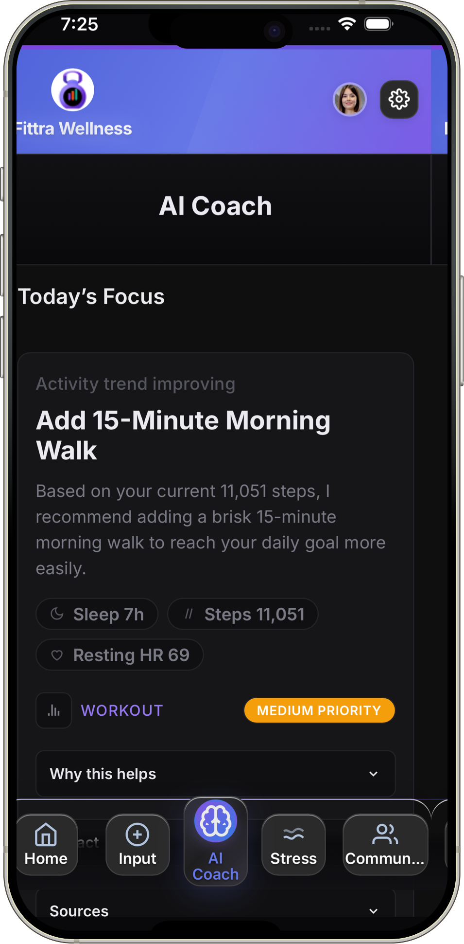
- Narrative over metrics. The home screen became a daily story, not a data dump. One prioritized recommendation with a plain-language explanation of why it was surfaced.
- Distributed onboarding. Instead of a long pre-use questionnaire, onboarding was spread across the first week. Three questions upfront, then the model builds progressively as the user interacts.
- Explainability by default. Every AI recommendation shows its reasoning. No black-box suggestions. This was validated in testing as the single biggest driver of trust.
- Dual data paths. The app had to work with or without HealthKit/Health Connect permissions, which meant designing two parallel experiences rather than gating features behind data access.
Research
Understanding behavior change, not just behavior
I conducted qualitative interviews with 70 wellness app users across different engagement levels, ranging from power users to those who had lapsed. The goal wasn't to understand feature preferences, but to identify the emotional patterns around motivation and dropout.
Key findings
- Users wanted to feel understood by the app, not just tracked by it
- Friction at the start of a habit was the primary dropout driver, not lack of motivation
- AI recommendations were only trusted when accompanied by a brief explanation
- Progress felt most meaningful when framed relative to the user's own baseline, not global averages
- Check-in fatigue was a real pattern; daily prompts felt like obligations rather than support
These findings directly shaped three foundational design principles: transparency over magic, low-friction entry points, and personal progress framing.
Solution
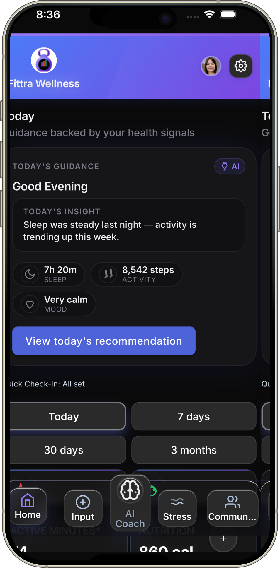
A dashboard that tells a story, not just a score
The home screen became a daily narrative rather than a metrics dump. A single prioritized recommendation sits at the top with a one-line explanation of why it's surfaced, followed by a lightweight status of active habits and a gentle prompt for the day's check-in.
Transparent AI recommendations
Every AI-generated recommendation surfaces a "why this?" disclosure: a short, plain-language explanation of what behavior pattern or data signal triggered it. This was validated in testing to significantly increase perceived trustworthiness.

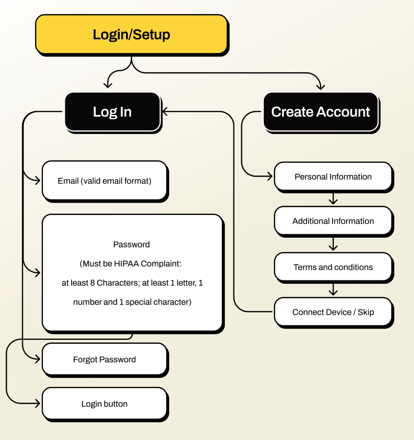
Progressive onboarding
Rather than a long pre-use questionnaire, onboarding was distributed across the first week of use. The app starts with three lightweight questions and builds its model progressively as the user interacts, reducing upfront friction while improving recommendation quality over time.
Native health data integration
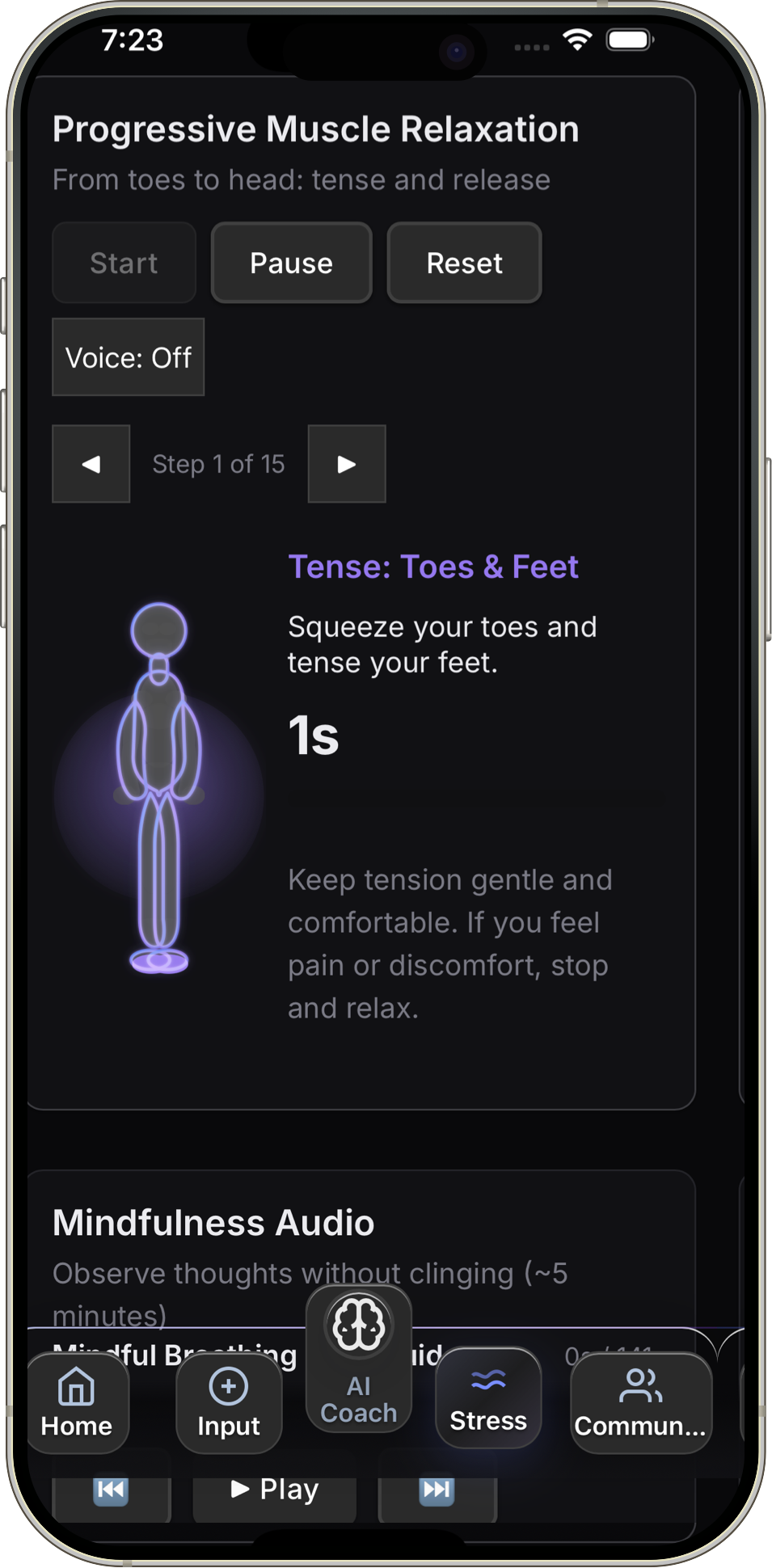
Fittra connects directly to Apple HealthKit and Android Health Connect, pulling in activity, sleep, and vitals data so users don't have to log everything manually. I designed the permission flows, data sync patterns, and the UX for surfacing platform health data alongside in-app tracking in a way that felt seamless rather than overwhelming.
Adaptive check-ins
Check-in frequency and timing adapts to the user's engagement history. High-engagement users receive brief daily prompts; low-engagement users see gentler weekly summaries to avoid reinforcing dropout patterns.
Constraints
Real-world tradeoffs that shaped the product
Fittra was built without a traditional engineering team. I collaborated directly with Builder.io to bring the product from design to a live app, which meant every design decision had to account for platform capabilities and technical feasibility firsthand.
- No dedicated engineering team. I worked directly with Builder.io, owning both the design and the implementation logic. Component reuse and design system consistency were how the product shipped at all.
- AI model limitations. Early recommendation quality was inconsistent. I designed progressive disclosure patterns that let the AI earn trust over time rather than asking for it upfront.
- Platform data gaps. Not all users grant HealthKit or Health Connect permissions. The app had to deliver a complete experience with or without platform data, which meant designing two parallel data flows.
- Onboarding vs. personalization tension. More upfront data means better recommendations, but longer onboarding kills retention. We chose a distributed onboarding model that sacrificed initial accuracy for engagement.
Design System
Built alongside the product, not before it
I established a component library in Figma as part of the build process, not as a separate deliverable. Each component was tokenized for color, spacing, and typography from the start, enabling consistent handoff and fast iteration in post-launch sprints.
- Color and typography tokens shared between design and development
- Core components: cards, recommendation tiles, habit trackers, input fields, progress indicators
- Accessibility-first: all interactive components meet WCAG 2.1 AA
- Dark mode support baked in from the beginning, not retrofitted
AI Trust
Designing AI that earns trust, not just attention
In a wellness context, a bad AI recommendation isn't just unhelpful. It can erode someone's motivation or reinforce unhealthy patterns. I designed guardrails into the recommendation system at the UX level to keep the AI accountable and transparent.
- Explainability by default. Every recommendation shows the data signal or behavior pattern that triggered it. No black-box suggestions.
- User override. Users can dismiss or deprioritize any recommendation. The system learns from dismissals without penalizing the user.
- Scope boundaries. The AI never offers clinical advice, diagnoses, or treatment suggestions. Language was carefully reviewed to stay within wellness guidance, not medical direction.
- Confidence signaling. When the AI has limited data (new users, sparse tracking), recommendations are framed as exploratory rather than prescriptive.
Responsible AI in health isn't just an ethics checkbox. It's a product quality issue. Users who trust the system engage more deeply and stay longer.
Outcomes
Fittra launched on iOS and Android and continues to iterate. Post-launch metrics showed meaningful improvement across the key behavior signals identified in research.
The biggest lesson: explaining the AI's reasoning wasn't a nice-to-have. It was the core trust mechanism. Users who saw explanations were twice as likely to act on a recommendation.
Available now